You’ve spent the budget. The logistics were a nightmare, but the crate arrived. You’ve got the team in matching shirts, the brochures are stacked, and the coffee is hot.
So why is everyone walking past you?
It’s the question that keeps marketing directors up at night. You watch attendees drift toward a competitor three rows down. Their product isn’t better. Their staff isn’t better looking. But their space feels… alive. Yours feels like a waiting room at the dentist.
The problem usually isn’t your product or your sales pitch. It’s likely your lighting.

The invisible friction in your booth design
Here is the reality of the convention centre floor: it is an assault on the senses. The overhead lighting in these halls is universally terrible—usually high-bay sodium or metal halide lamps that cast a flat, sickly yellow wash over everything.
If you rely on the venue’s lights to showcase your booth display, you are actively blending into the concrete floor.
Most businesses treat lighting as a utility. They think, “If they can see the product, we are good.” That’s wrong. Lighting isn’t about visibility; it’s about hierarchy. It tells the human brain what to look at and in what order.
When you are working with a standard 10×10 tradeshow booth, you don’t have the luxury of massive architectural structures to grab attention. You have limited square footage. If your space is dim, or evenly lit with no contrast, the eye slides right off it. It’s biological. We are programmed to look at the brightest thing in our field of vision. If that isn’t you, you lose the foot traffic.
Creating contrast creates customers
Think of your booth less like a shop and more like a theatre stage.
If a stage is fully lit from edge to edge with the same intensity, there is no drama. There is no focus. But if you dim the house lights and hit the lead actor with a spotlight, everyone shuts up and looks.
In a booth setup, you need to create that same contrast. You want “pools” of light.
I’ve seen companies spend five figures on a custom build but zero dollars on supplementary lights. Then there is the guy next door with a simple modular wall, but he clamped three high-output LEDs to the top frame. His graphics pop. His colours look correct. He looks expensive, even if he spent less.
There is also the issue of colour temperature. Those venue lights I mentioned? They usually run warm (yellow) or weirdly green. If you bring in your own lighting at 5000K or 6000K (cool white/daylight), your booth becomes a beacon of clean, crisp white light in a sea of dingy yellow. It signals freshness and modernity.
The Fix: A layered approach
You don’t need to hire a lighting engineer. You just need to stop relying on the ceiling lights. Here is a simple way to fix this without overcomplicating the logistics.
1. The Wash (Ambient)
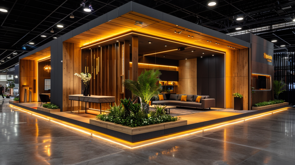
Start with the walls. If you are using a modular system, get arm lights (stem lights) that clamp to the top. Aim them at your graphics. This makes your back wall the brightest thing in your line of sight. If you are using SEG fabric (silicone edge graphics), consider backlit frames. A backlit booth design is essentially a giant light box. It is impossible to ignore.
2. The Highlight (Accent)
What are you selling? If it’s a physical product, put a puck light under it or a spot light over it. Maybe you sell software—then make sure the screen is the brightest point, not the carpet. You need to guide the visitor’s eye: “Look at the logo, now look at the product.”
3. The Vibe (Atmosphere)
This is where you can get clever. LED strips under the counters or behind a monitor add depth. It makes the setup look custom rather than rented.
Some might worry about the cost of electrical drops from the venue. It’s valid—unions charge a lot for power. But calculate the cost of not getting leads. If an extra $300 for power gets you five more qualified conversations because people actually stopped, the ROI is there.
Bottom line
Don’t let bad lighting kill your exhibition ROI. You can have the best widget in the world, but if it sits in the shadows, it stays in the shadows.
Take control of your environment. Brighten the walls, spotlight the product, and use a cooler colour temperature than the venue. It’s the highest leverage change you can make to your presence on the floor.
References
- Hultén, B., Broweus, N. and Van Dijk, M. (2009). Sensory Marketing. Palgrave Macmillan. (Discusses how visual cues like lighting affect consumer perception).
- Summers, T.A. and Hebert, P.R. (2001). ‘Shedding some light on store atmospherics: influence of illumination on consumer behavior’. Journal of Business Research, 54(2), pp.145-150.
- Gusland, C. (2023). ‘The Psychology of Trade Show Lighting’. Exhibitor Online.
