Let’s be honest for a second.
Have you ever stood in a crowded exhibition hall thinking, “Why is that tiny booth getting all the traffic?”
Or worse—“Why is my 10×10 trade show booth barely getting noticed?”
It happens more than most brands admit.
A lot of teams assume size equals impact. Bigger booth, bigger results. But on the show floor, attention doesn’t work like that anymore. Space is limited. Time is tighter. And visitors? They’re scanning, not strolling.
So the question isn’t how to make a bigger booth.
It’s how to make a 10×10 trade show booth work harder than it should.
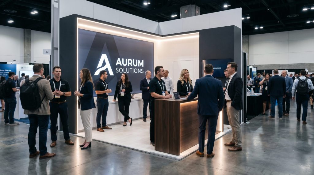
The Real Constraint: Attention, Not Space
From what I’ve seen across multiple shows, the issue isn’t the footprint. It’s focus.
A standard trade show booth’s 10×10 setup gives you just enough room to either:
- confuse people instantly, or
- convert them quickly
There’s not much middle ground.
Some exhibitors try to cram everything in—screens, shelves, messaging, products. The result? Noise. Visitors walk past because they can’t process it in three seconds.
Others take the opposite route. Clean layout. One message. One action. Those are the booths that stop people.
Maybe it’s not about space limitations. Maybe it’s about decision discipline.
What High-Performing 10×10 Booths Do Differently
After walking enough trade floors, a few patterns show up.
1. They Build Around One Clear Outcome
Not “brand awareness.” Not “show presence.”
Something measurable—leads, demos, sign-ups.
The best 10×10 trade show booth ideas usually start with a simple question:
What do we want people to do in under 2 minutes?
Everything flows from that.
2. They Use Visual Hierarchy Like a Weapon
People don’t read booths. They scan them.
Strong booths:
- Lead with one bold headline
- Support it with minimal text
- Use contrast to guide the eye
If everything is loud, nothing stands out.
3. They Respect Physical Flow
A 10×10 is tight. If your layout blocks movement, people won’t step in.
Effective trade show booths 10×10 often:
- Keep the front open
- Avoid bulky counters at the entrance
- position staff to invite, not guard
It sounds basic. It’s often ignored.
4. They Make Interaction Effortless
Touchscreens, samples, quick demos—fine.
But friction kills engagement.
Some exhibitors overbuild experiences. Visitors hesitate.
Others simplify:
- one product demo
- one quick interaction
- one clear takeaway
That’s usually enough.
The Rental Question: Flexibility vs Identity
Not every brand wants to invest in a custom build. That’s where 10×10 trade show booth rental options come in.
Rentals can work well—if used strategically.
Upside:
- lower upfront cost
- faster turnaround
- easier logistics
Trade-off:
- less uniqueness
- potential brand dilution
Some companies offset this by customising graphics, lighting, and messaging heavily. Others accept the trade-off and prioritise speed.
There’s no single right answer. It depends on how often you exhibit and how critical differentiation is at this show.
The “Product First” Layout
- Product-centred or slightly forward
- Messaging supports, not dominates
- Lighting draws focus
Useful if your product sells visually.
Where Most Booths Go Wrong
Patterns I keep seeing:
- too much text
- unclear messaging
- no defined action
- staff waiting instead of engaging
It’s rarely a design failure.
It’s usually a clarity problem.
So, What Should You Actually Do?
If you’re working with a 10×10 trade show booth, here’s a simple filter:
- If it doesn’t support your main goal → remove it
- If it slows down interaction → simplify it
- If it confuses the message → rewrite it
You don’t need more space.
You need fewer distractions.
Final Thought
Small booths are unforgiving. That’s what makes them effective.
They force decisions most brands avoid.
And maybe that’s the advantage—because when space is tight, strategy gets sharper.
References
- Centre for Exhibition Industry Research (CEIR) – Exhibition engagement studies
- Harvard Business Review – Customer attention and decision-making research
- Event Marketer – Trade show performance benchmarks
- Exhibitor Magazine – Booth design and attendee behaviour insights
