I keep hearing the same questions on the exhibition floor.
“Why is our booth busy for the first hour… then dead for the rest of the day?”
“Why do competitors with worse products get more traffic?”
“Are we just missing something obvious in our exhibition display stands?”
And honestly, after walking enough shows, I’d say yes — but not in the way most people think.
It’s rarely in the budget. It’s rarely a product.
It’s usually how the exhibition display stands are designed to behave in real human traffic.
Not how they look in renders. Not how they look in approvals.
But how do they actually pull strangers in under pressure, noise, and distraction?
Let’s break down what works and what quietly kills performance.
1. Win: Clear message in 3 seconds vs Fail: “We do everything.”
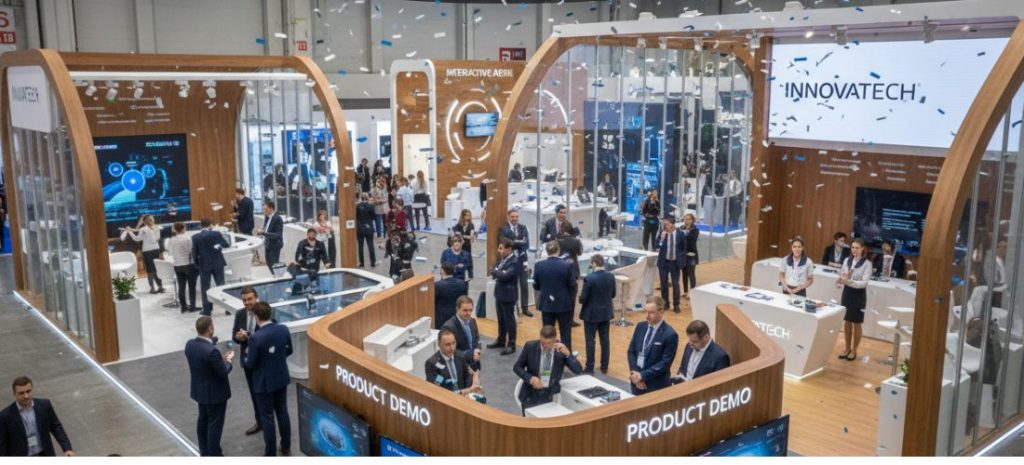
The strongest display trade show booth I’ve seen usually says one thing. Loudly. Visually. Immediately.
Others? They try to say everything.
When I looked at a Davita trade show booth-style healthcare setup, the winning version didn’t explain the entire ecosystem. It led with a single outcome-focused message, then backed it up with structure.
Fail version:
Too many claims, too many services, no focal point.
At a trade show, people don’t read. They scan.
If your exhibition display stands can’t answer “why stop here” in 3 seconds, you’ve already lost half the traffic.
2. Win: Open entry design vs Fail: closed “wall effect.”
Some booths unintentionally act like a barrier.
High walls, narrow entrances, boxed layouts. It feels safe for the brand… but it kills flow.
Winning trade show booth design ideas usually lean into openness:
- Multiple entry points
- Low visual barriers
- Natural walking paths
I’ve seen a simple layout outperform a premium build just because people didn’t feel “trapped” entering it.
The failed version? It forces commitment too early. Visitors don’t like that.
3. Win: One hero interaction vs Fail: scattered features everywhere
The best exhibition display stands don’t try to do five things at once.
They pick one:
- a live demo
- a tactile product wall
- a short immersive screen loop
- or a clear consultation desk
That’s it.
Weak booths spread attention thin. Screens on every wall. Flyers everywhere. Staff are pointing in different directions.
I remember a mid-sized tech brand using a clean “one-demo focus” layout. It beat bigger competitors simply because people knew where to stand and what to do.
Focus wins attention. Always.
4. Win: Staff positioned like guides vs Fail: staff hidden behind counters
This one sounds small but changes everything.
Winning booths treat staff as part of the design. They’re:
- positioned at entry angles
- visible, not buried
- trained to start conversations, not wait for them
Fail booths often place staff behind desks or screens. It creates distance.
Even in a strong display trade show booth, if the staff’s energy is passive, the whole stand feels dead.
People don’t engage with architecture. They engage with humans.
5. Win: Movement-driven layout vs Fail: static showroom feel
Some booths feel like a shop. Others feel like a flow.
The difference is movement design.
Good trade show booth design ideas guide people through:
- entry → hook → demo → conversation → exit
Bad ones create dead zones. People enter, stop, then leave.
One Davita trade show booth style healthcare activation I observed used a circular flow path instead of straight aisles. It kept visitors inside longer without feeling forced.
That’s the key: guided movement without pressure.
6. Win: Emotional hook vs Fail: product-first thinking
Most failing exhibition display stands start with product specs.
Winning ones start with emotion:
- relief
- speed
- confidence
- safety
- savings
Then they attach the product to that feeling.
On the floor, nobody wakes up thinking “I need a feature set today.”
They think, “I need a problem solved fast.”
If your booth doesn’t reflect that shift, it becomes background noise.
What I actually see across exhibitions
When I compare strong and weak booths side by side, it’s rarely about size.
It’s clarity vs clutter.
Flow vs blockage.
Energy vs passivity.
The best exhibition display stands are not “designed harder.”
They’re designed simpler — but with sharper intent.
And maybe that’s the uncomfortable truth for most teams:
More design doesn’t fix unclear thinking.
Final thought
If you’re planning your next build, don’t start with structure.
Start with this question:
“If a stranger walks past in 3 seconds, what do they instantly understand and feel?”
If you can’t answer that cleanly, no amount of budget in your display trade show booth will save it.
References
SEO Meta Package
Title Tag: Exhibition Display Stands: 6 Win vs Fail Trade Show Booth Ideas That Work
Meta Description: Explore 6 real-world trade show booth design ideas showing what works and what fails. Improve exhibition display stands’ performance with practical insights and proven layout strategies.
