Let me start with the questions I keep hearing on-site at exhibitions:
Why do some brands pull crowds while others get polite nods and empty booth hours?
Why does a polished trade show display sometimes feel invisible in a hall full of noise, light, and competition?
And why do teams spend thousands, sometimes hundreds of thousands, only to walk away saying, “We got leads… but not enough”?
I’ve been walking trade floors long enough to notice a pattern. It’s rarely about budget alone. It’s about decisions—small ones that stack up.
Some of them work hard. Others get ignored completely, even though people think they matter.
Let’s break it down.
The real problem nobody admits
Most companies treat a trade show display like a physical asset.
Something to “look good”, tick compliance boxes, maybe impress a few visitors.
But here’s the truth I keep seeing:
A trade show display is not a structure. It’s a behaviour trigger.
It either makes people stop, step in, and talk… or it doesn’t.
And in busy halls, “doesn’t” is the default outcome.
The issue isn’t effort. It’s misallocated effort.
5 things that actually work in a trade show display
1. Clear visual hierarchy (not visual overload)
The best trade show display I see on the floor usually does one thing well: it tells me where to look first.
Not ten messages. Not five slogans.
One anchor idea. Then support.
If someone has to “figure it out”, they walk away.
Others suggest that more graphics increase engagement. In reality, I see the opposite—too much competes with itself.
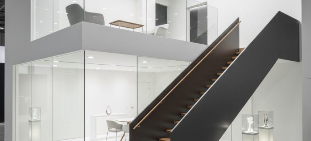
2. Physical openness that invites entry
Some booths feel like offices with walls. Others feel like open invitations.
Guess which trade show display gets more foot traffic?
Open corners, visible interiors, and nothing blocking the first step in.
It sounds basic, but I still see brands building “fortress booths” and wondering why people hesitate.
If the body doesn’t know where to enter, it won’t.
3. Live activity beats static branding
A static trade show display is background noise.
A live demo, conversation corner, or even simple product interaction changes the entire energy.
People don’t just look—they pause.
I’ve seen a simple 30-second demo outperform massive LED walls because it gave people something to do, not just see.
4. One clear hook sentence
Every strong trade show display I remember had a line that did the job instantly.
Not clever copy. Not brand poetry.
Something like:
“What if your lead cost dropped by 40% this quarter?”
Or:
“We built this in 10 days. No delays.”
It’s direct. It either resonates or it doesn’t. That’s the point.
5. Staff positioning and energy
You can’t design around people and then ignore people.
A trade show display lives or dies based on how the team behaves inside it.
Standing behind counters kills engagement. Sitting down kills momentum.
The best teams I see:
- stand at the edge
- Make eye contact first
- start conversations, not wait for them
It changes everything.
5 things people still overdo (and visitors ignore)
1. Over-designed graphics
A lot of teams still believe a trade show display is won by design complexity.
It isn’t.
Most visitors glance for less than 3 seconds. If they don’t get meaning instantly, they move.
Fancy gradients and layered visuals? Usually ignored.
2. Generic brand slogans
“Innovation. Quality. Excellence.”
Honestly, nobody processes that in a busy hall.
In a trade show display, generic messaging becomes invisible noise. It blends into every other booth saying the same thing.
3. Too many product lines on display
Trying to show everything inside a trade show display feels logical… but it dilutes attention.
I’ve watched visitors get overwhelmed and just leave.
Less range, more clarity. Always.
4. Passive brochures
Stacks of flyers sitting in a corner of a trade show display rarely move.
If someone didn’t care enough to engage, they won’t care enough to read later.
5. Over-reliance on screens
Screens don’t automatically equal engagement.
A looping video inside a trade show display is often treated like background TV in a hotel lobby.
If it doesn’t interrupt behaviour, it gets ignored.
What I’m really seeing on the floor
When I compare high-performing and low-performing booths, it’s not a mystery.
Winning trade show display setups do three things well:
They simplify attention.
They create movement.
They make conversation unavoidable.
Everything else is decoration.
And decoration is expensive when it doesn’t convert.
A more practical way to think about it
If I strip it down to something useful, I’d say this:
Before you build your next trade show display, ask:
- What is the one thing people should remember after 10 seconds?
- Where does the first conversation start?
- What causes someone to physically step inside?
- What can we remove without losing clarity?
If you can’t answer those cleanly, the design is probably doing too much.
Final thought
I’ve seen simple trade show display setups outperform huge, expensive builds more times than I can count.
Not because they looked better.
But because they worked harder where it mattered—attention, clarity, and human behaviour.
Most companies don’t need a bigger booth.
They need a clearer one.
References
- Center for Exhibition Industry Research (CEIR) – Exhibition and attendee behaviour reports
- Harvard Business Review – Marketing in live environments and attention economy insights
- Freeman Company – Trade show engagement and experiential marketing studies
- Forbes – Event marketing ROI and booth performance analysis
